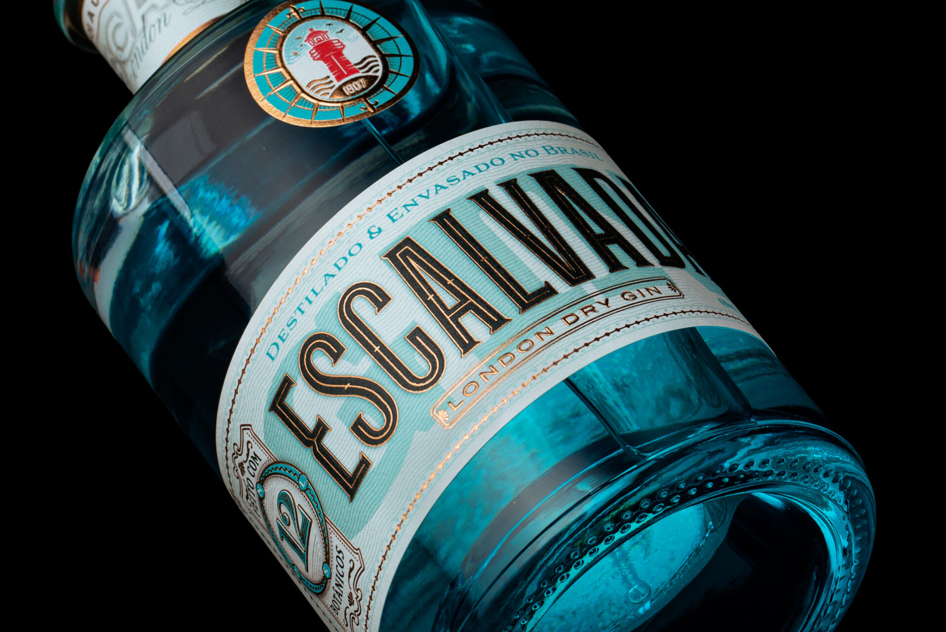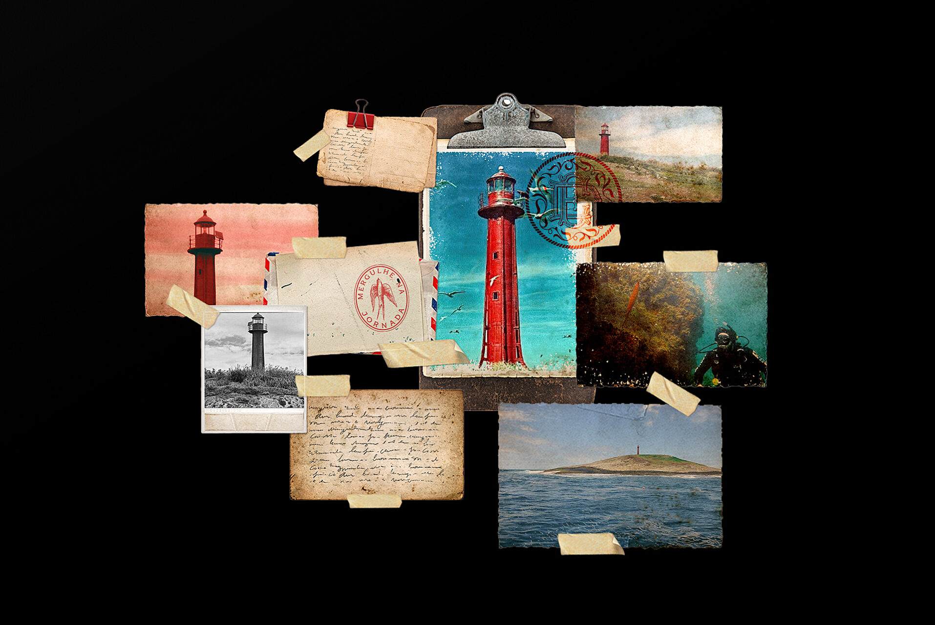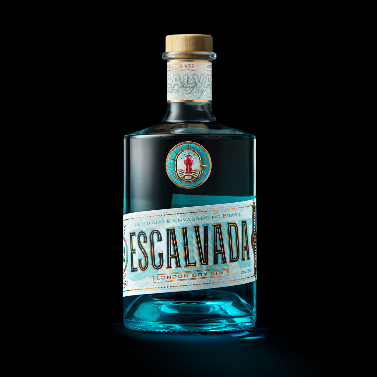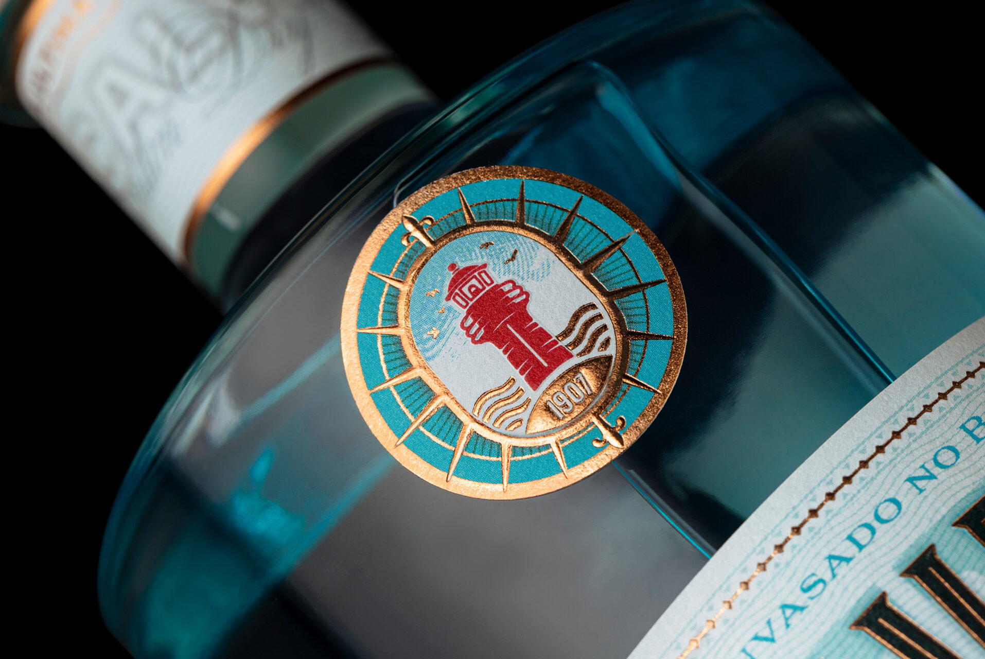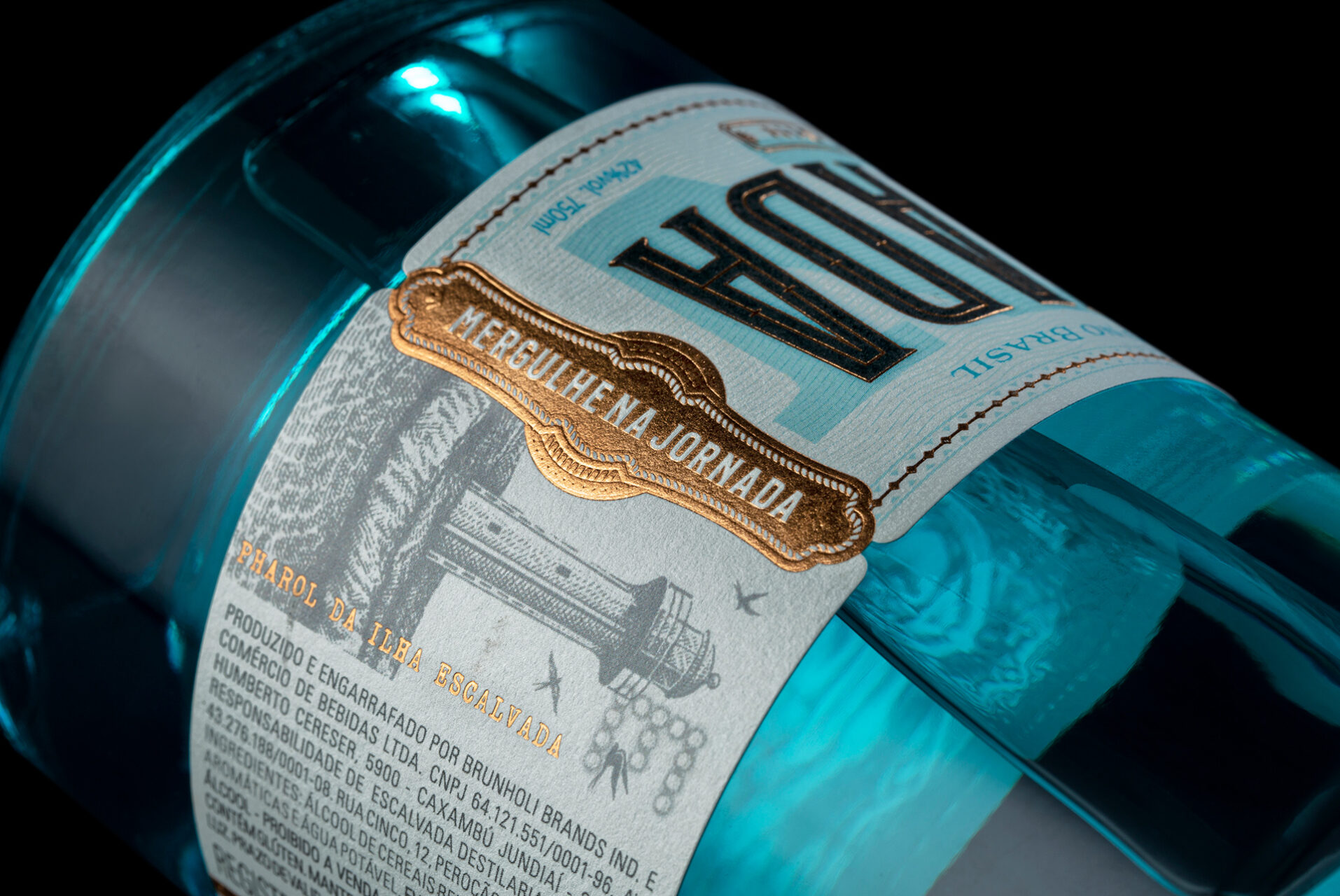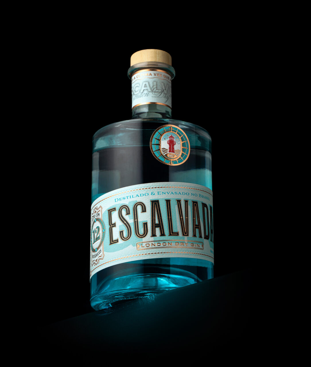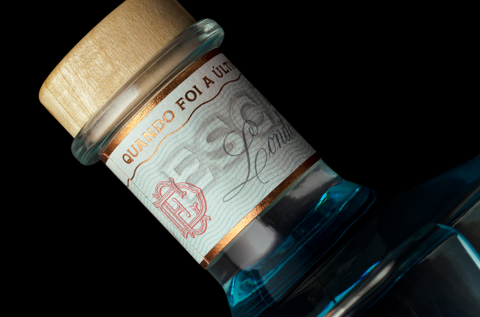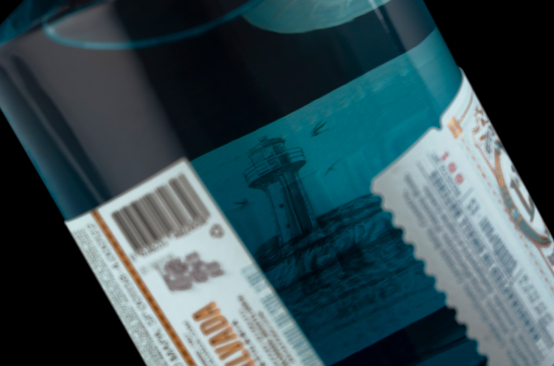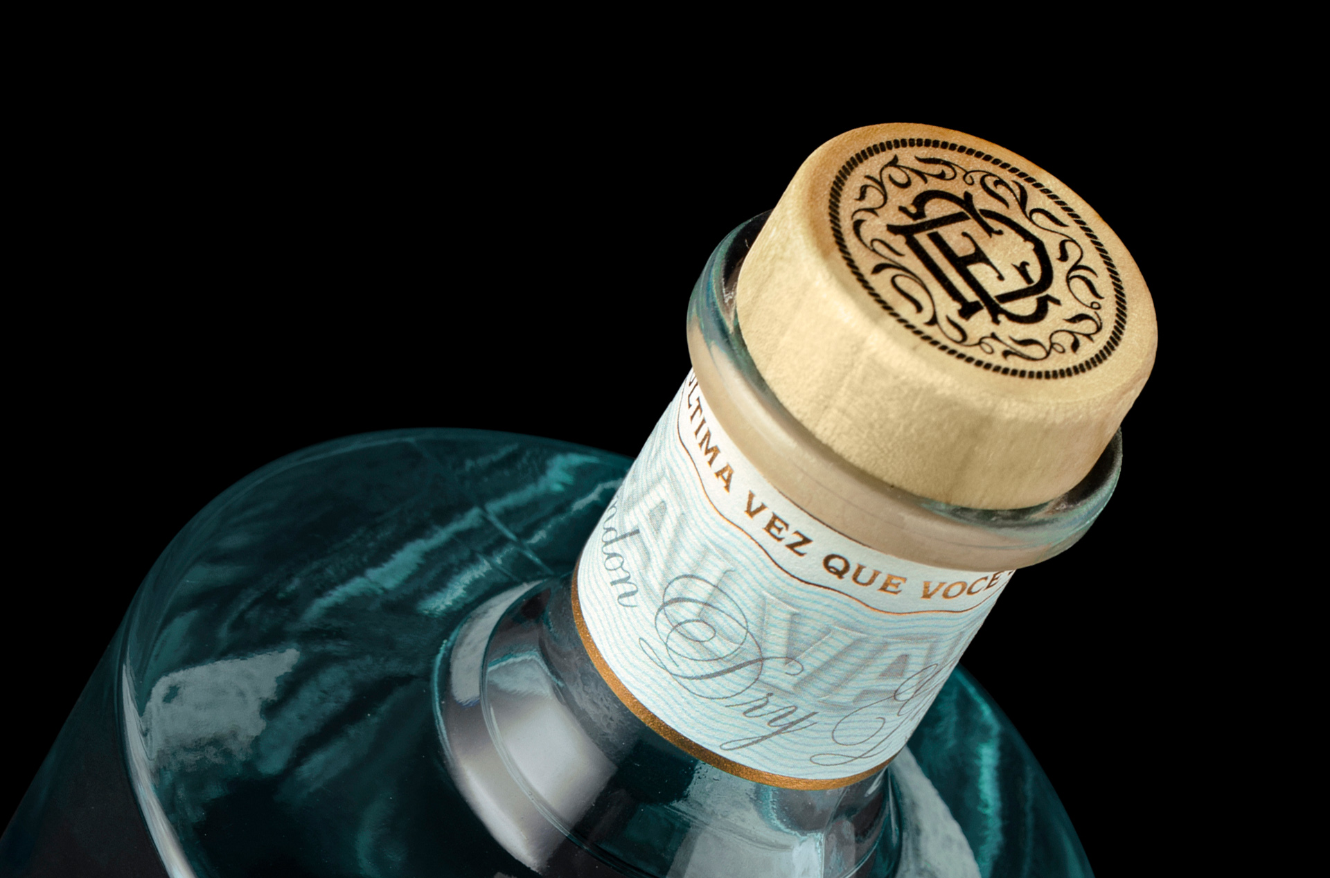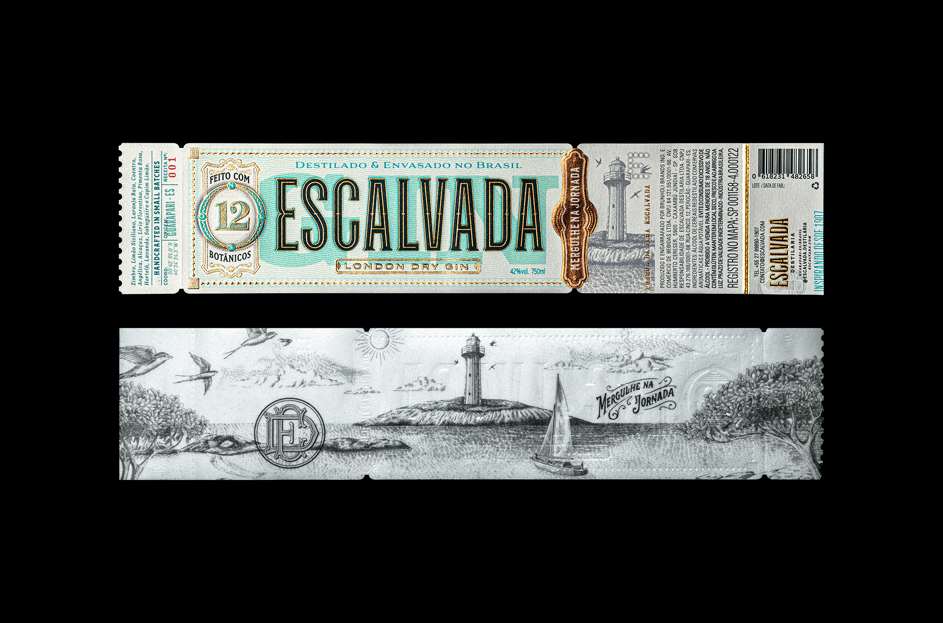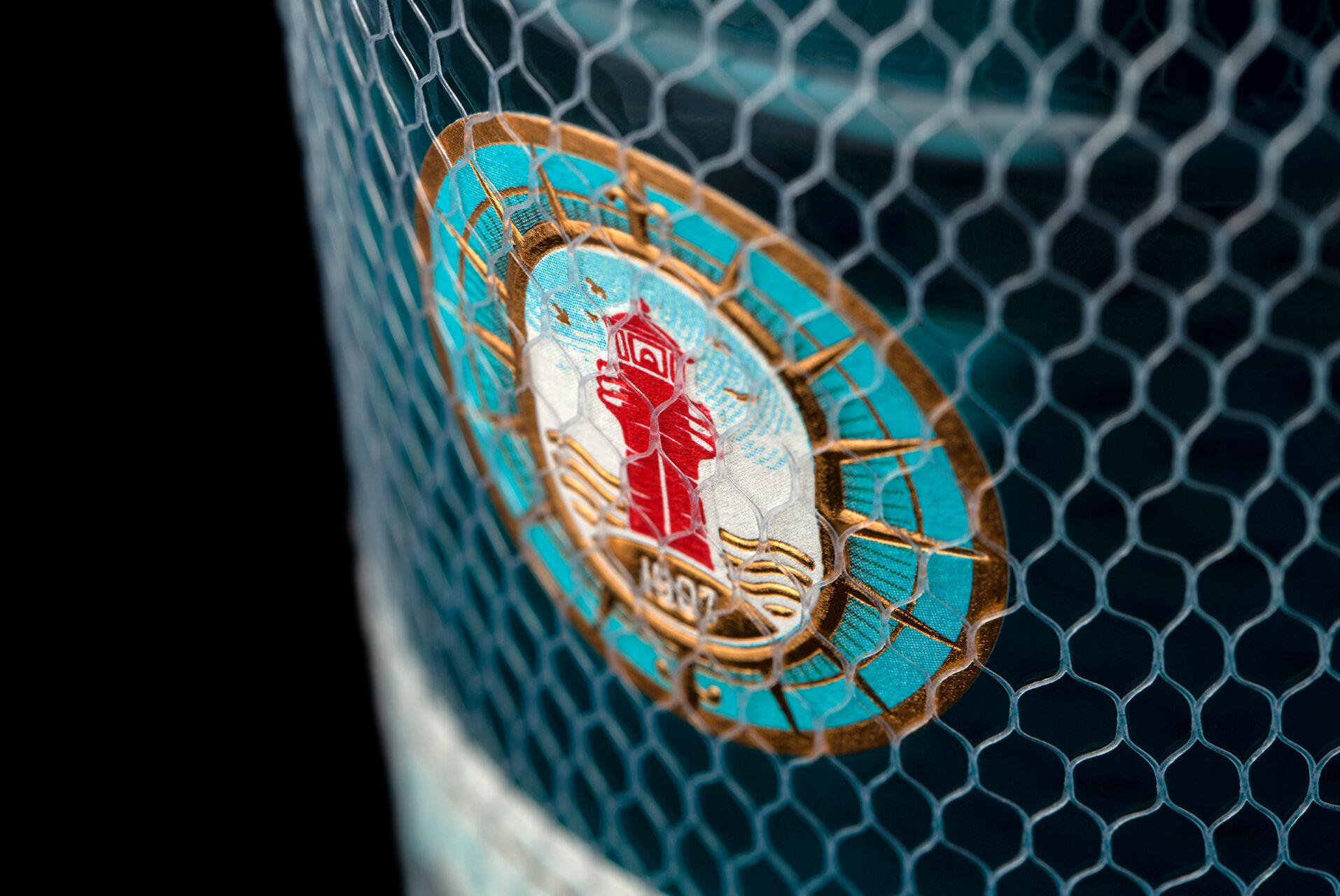

An invitation to dive into your Journey. Inspired by the name and beauty of a famous Island of Espírito Santo, Brazil, Gin Escalvada pays homage to a paradise location on a label inspired by old ferry and travel tickets. In a region rich in diversity and surrounded by exuberant nature Gin Escalvada personifies people looking for moments of relaxation and fun. An audience that wants to celebrate with elegance, enjoy with friends in a vibrant and relaxed atmosphere, whether day or night, on land or at sea. The inspiration for creating the label came from the tagline, created for the project “when was the last time you dive in?”. In essence it is an invitation to allow yourself. The details and aesthetics of the label refer to the origins of Gin production, recalling European drug label standards and the beginnings of the drink. The Turquoise Blue refers to the sea and the purity of the elements in red and recalling metals and rivets associated with the physical structure of the Escalvada Lighthouse, a monument with a reddish tone, existing in the center of the island and which gives rise to the symbol. Rich in detail, the label also has an illustration printed on the inner side of the label, creating a provocative atmosphere when turning the bottle in order to convey the message of inviting you to visit the island. In this project, Holy Studio, going beyond the labels, developed the branding process following the pillars of label positioning and launching to the market a solid and cohesive brand platform with the elements of verbal visual identity and digital presence aligned with the purpose of the brand.
Escalvada. Dive into the Journey
—
Um convite para mergulhar na sua Jornada. Inspirado no nome e na beleza de uma famosa Ilha do Espírito Santo, Brasil, o Gin Escalvada é uma homenagem a um local paradisíaco em um rótulo inspirado em antigos ingressos de balsas e viagens. Em uma região rica em diversidade e cercada por natureza exuberante O Gin Escalvada personifica as pessoas que buscam por momentos de relaxamento e diversão. Um público que quer extravasar com elegância, curtir com os amigos em uma atmosfera vibrante e descontraída, seja de dia ou à noite, seja em terra ou seja ao mar. A inspiração para criação do rótulo veio da Tagline, criada para o projeto “quando foi a última vez que você se jogou?”. Em essência é um convite a se permitir. Os detalhes e estética do rótulo remetem às origens da produção do Gin, lembrando padrões de rótulos europeus de medicamentos e dos primórdios da bebida. O Azul Turquesa remete ao mar e à pureza os elementos em vermelho e lembrando metais e rebites associados à estrutura física do Farol da Escalvada, monumento de tom avermelhado, existente no centro da ilha e que dá origem ao símbolo. Rico em detalhes, o rótulo ainda conta com uma ilustração impressa no lado interno do rótulo, criando uma atmosfera provocante ao girar a garrafa buscando transmitir a mensagem de convidar a conhecer a ilha. Neste projeto a Holy Studio indo além dos rótulos, desenvolveu o processo de branding seguindo os pilares de posicionamento do rótulo e lançando ao mercado uma plataforma de marca sólida e coesa com os elementos de identidade visual verbal e presença digital alinhados ao propósito da marca.
Escalvada. Mergulhe na Jornada